If you’re reading this, there’s about a 75% chance you’ve never been here before; at least, that’s what my stats tell me. For those of you stopping by for the first time and actually seeing the home page instead of just hitting my post about Australian Rules Football or Chicken Enchilada Pasta (my two primary sources of traffic via google keywords), please be aware that things around here are about to pick up again.
I’ve been preoccupied for the summer, and for that I am not even the tiniest bit apologetic. But, that time is coming to an end. Once I dig my way back out of the upcoming minor depression, I plan to go back to writing with at least my past intermittent bursts of output.
The other thing that new visitors won’t recognize is the significant revamp I’ve put into the site’s design and look-and-feel. I would gladly take any feedback and suggestions anyone has about any aspect of the new paint and trim. Hate the font? let me know. Think the background and link color is more “Pottery Barn” than “masculine moss?” Let me know. Find the comment balloons irritating and unsightly? Too bad.
If there’s something about the site after the change that “just works” or “just doesn’t” please drop a comment and let me know.
Wait… who are you again? 😛
Yeah, yeah…it has been a while…
Glad to see ya in my feed reader this morning!
Glad to be in your feed reader. I have a couple more in the hopper so we’ll see if we can avoid going three months between posts again.
Hi there. And welcome back. I hope you’ve enjoyed your break for much-deserved family time. On the topic of feedback…I like the green. It doesn’t strike me as Pottery Barn peat moss, but in the interest of full disclosure, that wouldn’t be a bad thing to me if it did.
That was kinda my feeling about it. I got some good suggestions about maybe going with a “season” choice, like an autumn orange and a christmas-y green or red (or blue and silver?), etc. We’ll see how that fancy takes me. A trustworthy source said “pottery barn green” and I have to admit I sort-of agree…but I’m not sure I have a problem with that. I like pottery barn, hate me if you have to.
One suggestion I have is to have the name of your blog– My Bad Pants– somewhere on or near the header image (unless it’s there somewhere, and I’m an idiot and can’t see it).
Originally I had the title above the header…but WOW was it taking up too much space. Like an additional 80 px which was pushing the top of the blog post header below my browser window even when full sized. That wasn’t working. I’ll try to see what I can to about re-sizing the title box and turning it back on again. That’s still on the “to do” list.
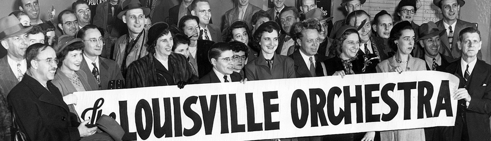
Regarding the header pictures, I super-love the image of the woman’s face. Without a doubt, my favorite of this batch too. I like the orchestra photos and the book spines. Also good ones… I’m not crazy about the barrel/keg picture. Really? That’s another one I particularly like. I have to admit the cigar one and the two sky-lines are my least favorites. There are fourteen headers total, which might have been overkill.
Overall, I think the format is great. It’s simple and easy to follow.
I’m glad, that was the point of the revamp…make the whole thing a bit more inviting. Convince a few more people to click past the landing page. Next step is to try and get more people to comment.
One question I have– Is the 365 days of blogging word count total continually uppdating, or was this info for a prior year? It doesn’t seem to be increasing, but maybe I’m imagining that.
It’s just broken. I have to re-think that feature, but for now it’s just a placeholder.
Anyway, I’m super-excited about your return to writing. Though I don’t envy your upcoming minor depression. I recall the post last summer with the airport shot. That gets to me.
I’ve decided not to do that again. I’m not sure I’d survive putting another one together.
You can keep the same photos you already have and use GIMP (free photoshop thingie) to put the title of your blog on them. WordPress allows you to randomly rotate images that you’ve uploaded, so all you have to do is save their images, plop a box of text on it with gimp, and reupload.
I’ve had a copy of Photoshop since version 3.14 (which came on 3.5″ Floppy Disks as well as Shiny New CDs!!!) and I gave a lot of thought to tagging in my brand over the images and calling it good…but I was consistently unhappy with the results. What I NEED to do is grind into the css and actually get the title box down to something manageable that doesn’t look like ass. That’s on me, and I’m still not done with that yet (but whooooooboy you should have seen some of the failed attempts).
Don’t I make revamping and uploading 14 separate photos sound so simple? I should go into sales.
You herd an executive. You sell sanity wrapped in reality, and don’t you forget it.
PS: Manly Moss: Should you ever decide to be a spy, that should totally be your codename.
That seriously beats my old spy name of “awesome possum” so you’ve got yourself a deal!
I think it looks fantastic. Only thing I would say is use a reply to comments thingy, rather than adding your replies to the already written comment. That’s a personal thing for me though.
So…I’d be lying if I said this comment didn’t make me rethink my entire comment communication method. So, I’ll explain how we got to where I’m at and then explain my ongoing thinking.
When I started my first blog there was no way to thread comments or reply directly to a comment “up the chain” in a meaningful way. I always felt like my replies were hacked up and after the fact…sort of a “day late and a dollar short” kind of sensation, and it caused me to comment less and less on my own posts. And I LOVE comments. I LOVE the conversation.
I saw on some other blogs that the author started stitching in replies with bold text, and that REALLY worked for me. It let me respond directly, to have an actual conversation with the commenter as I read their comment. It let each reply be direct and personal.
Of course, it also makes comment threads harder for some people to follow with feed readers, and forces commenters to return to read my replies. I get how that’s not optimal for some people. Also, some people DO NOT like my responses inline with their thoughts, and I understand that, though I hope they can understand my personal style and not be offended by my process.
All that said, modern blog styles are MUCH better, and I could certainly thread the comments and reply directly to everyone, create breakout threads of comments, etc.
Except that I HATE threaded comments (i.e. the livejournal look) with the intensity of a thousand burning suns. No real reason other than years of reading slashdot and wanting to kill people. I identify threaded comments with trolls and evildoers, and I just can’t bring myself to do that here. Obviously, trolls and evildoers are NOT likely to come here, but stylistically I just can’t quite bring myself to change “what’s worked” for so long.
Also, by not commenting on my own posts, I don’t skew my comment statistics and can get a good feel for what posts prompt conversations, and what posts do not. It works for me.
I love how clean and easy to read the site is (it was before, but it still is now, so yay!)
I didn’t find the last design all that easy to read. The three column layout was choking the content into a narrow newspaper-like strip that just felt overwhelming when I’d look at some of my (already overly-) long posts. The new layout has a print style font, but a wider footprint and just doesn’t feel as squished to me. I felt like it worked, and I’m really glad to know that other people thing so too!